The Most Important UI Design Principles Every Designer Must Know

Learn the fundamentals of UI design and develop a comprehensive understanding of the most important principles that guide effective user interface design. This comprehensive guide will help you create intuitive, user-friendly interfaces for any digital product that your users will love

UI design principles are the guidelines that need to be followed when designing user interfaces. These principles help ensure a consistent and intuitive experience for users and make sure that the interface is easy to use. In this article, we will discuss some of the most important UI design principles, such as consistency, visibility, feedback, and simplicity. We will also explore how these principles can be applied in various use cases to create an effective user interface.

Accessibility

Designing user interfaces that are accessible means making them usable for those who have impairments. Designing with accessibility in mind takes into account those with cognitive or neurological illnesses, as well as those who have visual, auditory, or movement disabilities. For instance, designers may make their interfaces more accessible by using colour contrast, larger font sizes, and alternative text for pictures.

Because there are more than 1 billion persons with disabilities worldwide, accessibility is an important factor to take into account when designing user interfaces. For example, VoiceOver features allows visually impaired users to navigate their products using spoken descriptions.

  • You can use the WebAim Color Contrast checker to check the contrast ratio of your colours used.
  • You can check WCAG (Web Content Accessibility Guidelines) for more details on Accessibility Guidelines.

Alignment

The visual arrangement of items on a screen to produce a sense of harmony and order is known as alignment. An interface’s aesthetic appeal may also increase with proper alignment, which facilitates easier interface navigation for users. An interface may be made more ordered and organised by utilising techniques like aligning text to a grid or applying a constant gap between items. According to research, perfect alignment may lower bounce rates and boost user engagement.

Consistency

The use of the same design patterns and elements throughout an interface is referred to as consistency in UI design. Consistency fosters familiarity and makes it easier for people to grasp how to utilise interfaces. Users may feel more at ease using an interface if button positioning, typography, and colour schemes are all consistent.

Contrast

The term “contrast” describes the variation in colours and brightness levels of components on a screen. Contrast may be utilised to draw attention to key details and provide visual appeal. For instance, utilising high contrast colours for call-to-action buttons might boost their visibility and users’ propensity to click on them.

  • You can use the WebAim Color Contrast checker to check the contrast ratio of your colours used.
  • A contrast ratio of 3:1 is the minimum level recommended by [ISO-9241–3] and [ANSI-HFES-100–1988] for standard text and vision.

Grids

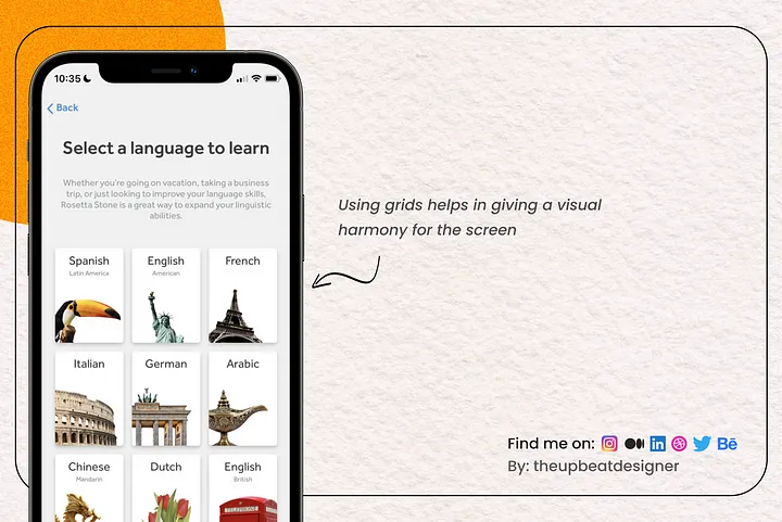
Grids are a type of visual framework that is used to arrange material and give an interface a feeling of structure. Designers may align objects and achieve visual balance by using grids. Designers can create an uniform layout for pages or screens in an interface, for instance, by utilising a grid.

Minimalism

Using just the components necessary to convey information and produce the intended results is referred to as minimalism in user interface (UI) design. With an emphasis on usefulness and practicality, minimalist designs are frequently visually straightforward and tidy. Use of negative space or white space, for instance, may convey a feeling of simplicity and elegance.

Minimalist designs can also boost user engagement and helps to reduce cognitive load. For example, Apple’s iOS design is known for its simplicity and minimalism.

Typography

The employment of fonts and typefaces to convey information and establish a visual hierarchy is referred to as typography in user interface design.

In UI design, typography is essential because it influences the readability, usefulness, and overall aesthetics of an interface. Typography may be used by designers to establish a tone, communicate branding, and distinguish between various sorts of information.

Designers can, for instance, use a serif font for body text to make it easier to read while choosing a sans-serif font for headers to give them a contemporary, clean look. In order to establish a visual hierarchy and direct users through the interface, they can also change the font sizes, weights, and spacing.

Responsiveness

Designing user interfaces that are responsive means making them suitable for a range of screen sizes and devices. Designing for various screen sizes has become essential to delivering a smooth user experience in the age of smartphones and tablets. Regardless of the device, whether it be a desktop computer, tablet, or smartphone, responsive design makes sure the interface is usable and accessible on all of them.