Color Matters in UX/UI Design

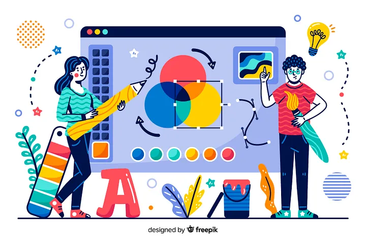
When we use a product, the initial impact we experience is the design’s aesthetic appeal.

If it pleases the eye, we are more inclined to explore more, and our initial judgment is likely to be positive. However, if the design is not visually appealing, it can have a negative impact on our perception of the product.

Color, in particular, plays a significant role in the first impression a user has when seeing and using a product. It has the power to evoke pleasure, evoke emotions, and create a visual impact that keeps our attention engaged.

When the color is visually pleasing, it captures our focus and encourages us to spend more time exploring the product. But, if the color is used in the wrong way, it can be a complete disaster!

Negative Effects of Poor Color Usage

When my QA colleagues test an app or a digital product, the first comment I often hear from them is about the product’s aesthetics. They express their opinions on whether it’s good or not, and most of the time they specifically comment on the color.

They say things like:

“This makes me feel so depressed.”

“The colors are so glaring that it hurts my eyes just to look at it.”

“It looks so ugly.”

“I can’t read the text properly. The color is too shiny.”

You can see in these examples that there is a negative impact on the user experience.

Otherwise, if we only use color as a decorative element, it can lead to another poor user experience. Colors that are excessively vibrant and saturated may initially be visually appealing, but they can also cause eye strain and fatigue.

Moreover, if we only select colors without considering the varying degrees of visual abilities among individuals, it can result in a negative experience for those who have a degree of visibility.

Choose the Right Color Palette

Selecting a color doesn’t mean picking the prettiest one. Anyone can do that! Color needs to be functional, not just decorative. It’s about communicating with your audience and serving their needs effectively.

Every color generally has a universal association, but its meanings can vary depending on the geographical context. Understanding your audience is crucial. If your product targets a specific demographic area, it’s essential to conduct research to ensure that the color associations align with the intended message, considering potential cultural variations.

In the image below, you can see the universal associations and emotions that colors can evoke in a person. Each color has a distinct emotional impact. As an example of that, studies have shown that seeing red can increase blood circulation.

In addition

In addition to these two tactics for selecting a color, it’s essential to align with the brand’s colors. To maintain consistency with the brand, I recommend examining the brand’s logo and choosing an appropriate color from there. Keep in mind that some logo colors may be too vibrant, leading to ocular fatigue. A solution to this issue is to reduce the saturation of the color.

When it comes to applying contrast, it’s essential to do it the right way. The level of contrast should align with the importance of each element on the screen.

For instance, elements that are crucial for user interactions or essential content should have the most significant contrast to draw immediate attention. By employing contrast strategically, you guide users’ focus to the right places and enhance the overall usability and visual hierarchy of your design.

After selecting the color palette, the key to knowing if it’s the right one is through user testing. By testing the product with your target users, you can gather valuable feedback on the color choices.

Users’ responses will provide insights into whether the color palette resonates with them and enhances their experience or if adjustments are needed to improve its effectiveness.